98.css
Posted by lopespm 1 day ago
Comments
Comment by jordanscales 1 day ago
Comment by sphars 1 day ago
Comment by woqe 1 day ago
Edit: After reflecting on this situation, your creation, your art: the css library paired with your story gave me a modern day Norman Rockwell dopamine hit. This has been an absolute experience, bravo to the collaboration!
Comment by sphars 1 day ago
I do appreciate your thoughts and I too hope I'm not being fooled by an AI :)
Comment by DigiEggz 6 hours ago
Comment by montag 1 day ago
Comment by RedShift1 1 day ago
Comment by vibbix 1 day ago
PS: while doing research on my project, I found your portfolio site as well. Was shocked to see we had the exact same taste in music, and genuinely made me curious if everyone whose doing retro throwbacks libraries did as well.
Comment by Gabrys1 1 day ago
Comment by jordanscales 19 hours ago
> Tabs should be managed by adding custom javascript code. All you need is to add the [aria-selected=true] attribute to the active tab.
Comment by efreak 9 hours ago
Comment by M95D 22 hours ago
Very nice!
Comment by maxquinn 18 hours ago
Comment by dataAI 23 hours ago
Comment by timnetworks 1 day ago
Comment by rozap 1 day ago
Comment by dsp2 1 day ago
Comment by bdickason 1 day ago
Comment by redbridgerock 23 hours ago
Comment by mattgerstman 1 day ago
Comment by titzer 1 day ago
Comment by uproarchat 1 day ago
Comment by sodapopcan 1 day ago
Also, the way multi-row tabs Just Work in the UIs of yesteryear *chef's kiss*
Comment by spankibalt 1 day ago
Flat, or quasi-flat (minimalistic/brutalist), design is fantastic if one makes use of appropriate visual discriminators, e. g. shadows, outlines, contrasts etc. Less is more here. Which makes this design philosophy clash with Apple's, Google's, or their imitators, oversaturated Fisher-Price playdough-UIs.
Comment by acchow 1 day ago
And here we are.
Comment by cube00 1 day ago
It took me way too long to realise those widgets that show stats quickly counting up are only there hoping you'll wait until they finish counting to see the total number. All to increase your time on the page and make the metrics look good for the designer.
Comment by theandrewbailey 1 day ago
Comment by inigyou 1 day ago
Comment by ObscureScience 1 day ago
Comment by sodapopcan 1 day ago
I have this really fond memory of showing my friend (who is still one of my good friends in adulthood) who had installed XP that he could change the theme "back" to look exactly 95/98/2000. His reaction was this very earnest "I love this..." as he clicked around like he was experiencing again for the first time. Anyway, ya, getting a bit off topic into memory lane, but we just had cool UIs back then.
Comment by spaghettifythis 1 day ago
Comment by sodapopcan 1 day ago
I don't think that more-tabs-that-can-fit-on-one-"line" is ideal, but I think the modern equivalent - horizontal scolling tabs - is waaay friggin' worse. I've been confused by those before whereas the first time I encountered multi-row tabs in the "depth style," I had zero confusion about what I was looking at.
Comment by hdjrudni 1 day ago
The moving tabs issue we can fix but just not moving them.
And the vertical space issue is much less of an issue now than it was then because we have higher resolutions but the answer to that is to start closing tabs when you can no longer see your content. It's like a quiet little nag that says you have too much stuff open.
Comment by inigyou 23 hours ago
Comment by dysoco 14 hours ago
Now I long for skeuomorphism, but if that becomes the norm for 10 years... after that who knows?
Comment by RedShift1 1 day ago
Comment by akx 22 hours ago
Finally decided to do something about it: https://github.com/jdan/98.css/pull/230
Comment by gnabgib 1 day ago
2024 (471 points, 93 comments) https://news.ycombinator.com/item?id=42056918
2022 (606 points, 182 comments) https://news.ycombinator.com/item?id=33310554
2020 (838 points, 211 comments) https://news.ycombinator.com/item?id=22940564
Comment by culi 1 day ago
https://alexbsoft.github.io/win95.css/ windows 95
https://bootstra386.com/ 1980's websites
https://botoxparty.github.io/XP.css/ windows xp
https://code.divshot.com/geo-bootstrap/ geocities
https://cs16.samke.me/ counter strike 1.6
https://edwardtufte.github.io/tufte-css/ edward tufte
https://jdan.github.io/98.css/ windows 98
https://khang-nd.github.io/7.css/ windows 7
https://micah5.github.io/PSone.css/ playstation one
https://nostalgic-css.github.io/NES.css/ nes
https://sakofchit.github.io/system.css/ apple system
https://snes-css.sadlative.com/ snes
https://thesimscss.inbn.dev/ the sims
Comment by sphars 1 day ago
Comment by mrkpdl 22 hours ago
Comment by _superposition_ 1 day ago
Comment by culi 1 day ago
Comment by mysterydip 1 day ago
Comment by OsrsNeedsf2P 1 day ago
Also shout out XFCE-winxp-tc, which makes your Linux look like Windows XP. Lots of people know about Chicago95, but this project is excellent for that 2004 vibe
Comment by dylan604 1 day ago
Comment by ranger_danger 1 day ago
Comment by Gualdrapo 1 day ago
Plus the icons thing - they're not as easy as people might think.
But this xfce-winxp-tc seems to be really, really close to the original. In those first two screenshots I thought it was just screenshots of the original WinXP.
Also the CSS framework subject of this thread looks really identical to the widgets and stuff of Win98.
But if you want true 100% pixel-perfect windows 98/xp/whatever... Just use them.
Comment by blurgo 1 day ago
Comment by zemo 1 day ago
Comment by cube00 1 day ago
> Reconsider disabled controls. Disabled controls can be hard to use because users literally have to deduce why they are disabled. Disable a control when users expect it to apply and they can easily deduce why the control is disabled. Remove the control when there is no way for users to enable it or they don't expect it to apply, or leave it enabled, but provide an error message when it is used incorrectly.
> Tip: If you aren't sure whether you should disable a control or provide an error message, start by composing the error message that you might provide. If the error message contains helpful information that target users aren't likely to quickly deduce, leave the control enabled and provide the error. Otherwise, disable the control.
Unfortunately, that nuance has been lost in the modern version of the guidelines with no mention of disabled buttons at all [2]
[1]: https://learn.microsoft.com/en-us/windows/win32/uxguide/top-...
[2]: https://learn.microsoft.com/en-us/windows/apps/develop/ui/co...
Comment by inigyou 23 hours ago
Comment by deathanatos 1 day ago
> Remove the control when there is no way for users to enable it
That guidance is unhinged, and is exactly the anti-pattern that upthread points to that needs to die.
Removing the control is like gaslighting the user: they're looking for "how to do X?" and documentation, Internet searchable screenshots, and, god help us, now AI, are pointing them at a button that does not exist. I cannot tell you how many times I've frustratingly circled that mulberry bush as a user, for a wide range of products.
No, the button (and all other UI elements) should always present/be visible, and if there is a disabled control, there should be a HIG-standardized way to determine why it is disabled. (I.e., a mandatory tool-tip that states what actions would cause the control to enable, though I'd accept that tool-tips themselves are not always discoverable. You could have a small, standardized icon on the disabled control, like an :information-symbol-emoji: that might hit towards the tool-tip, or just put in underneath.)
Comment by preg_match 1 day ago
Also, way more question mark buttons. I don’t care how well named people think things are. They’re not, and there’s always some hidden behavior you just have to know behind every setting. Include the question mark.
Comment by fodkodrasz 23 hours ago
Comment by nitin7 1 day ago
However, if the user can and they expect to do it, but is in a mode/state which doesn't allow them to do it, greyed out buttons absolutely.
In some cases, greyed out buttons should be clickable (eg. forms) and that should tell the user what is wrong. Looking at you, billion dollar airline, where I couldn't complete my checkin due to this annoyance.
Also, what happened to hover messages and little (?) marks? Every software behaves like it expects me to know what to do from Day 1.
Comment by xboxnolifes 23 hours ago
I wish every button or menu option that has a shortcut would show me its shortcut on hover or in-place so I didn't have to find it in the manual or buried in the settings menu.
Comment by efreak 9 hours ago
Comment by inigyou 23 hours ago
Comment by fodkodrasz 23 hours ago
I truly hate fast-food kiosks for this reason: most expect me to be familiar with their offerings and the menu system of that kios. I relatively rarely visit such places and I was better off with a human asking me 1-3 short questions and paying. I'm not paid to know this shit, I'm the customer. Guess I'm just too old, younger people love this crap for some reason.
Comment by efreak 9 hours ago
Comment by pkage 1 day ago
Comment by pxtail 1 day ago
Comment by zkmon 1 day ago
Comment by akoboldfrying 1 day ago
I suspect those UI designers have been working on your comment, too
Comment by bhouston 1 day ago
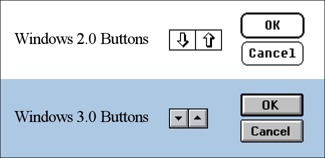
Btw default buttons like OK should have a thick black outline.
Also windows UIs loved group boxes and radio buttons and checkboxes. I notice those are missing.
Also it seems that the dropdown is missing.
Comment by codazoda 1 day ago
Comment by kushalpandya 1 day ago
Comment by jhoechtl 1 day ago
Understanding what is required to make a good UX site, and idenifying the minimum neccessary technological components is it.
Comment by fodkodrasz 23 hours ago
Comment by sshworld 1 day ago
Comment by songhonglei1985 1 day ago
Comment by TheAceOfHearts 1 day ago
When using the TrackBar widget, equivalent of <input type=range min=0 max=100 value=0>, assuming you have value 0 / 100 if you click on the line bar it will jump to the 20 value regardless of how far or close you click on the line [0]. I found that behavior very surprising, and would've expected it to jump to wherever you clicked.
[0] https://bsky.app/profile/cesarandreu.bsky.social/post/3mitlr...
Comment by danielrmay 1 day ago
Comment by CM30 16 hours ago
However, is there any JavaScript functionality implemented here? I tried clicking on the tabs in the tab component, and nothing happened. There's also no talk about that side of things on the page itself.
So, would be nice to have some sort of scripting functionality for the more interactive elements here.
Comment by hilti 22 hours ago
Comment by lambdaone 1 day ago
Comment by pdntspa 1 day ago
Comment by fitsumbelay 1 day ago
Comment by neya 1 day ago
Comment by masklinn 1 day ago
Comment by luciana1u 1 day ago
Comment by ithadhumor 1 day ago
Comment by reddalo 23 hours ago
Comment by ghtbircshotbe 15 hours ago
Comment by Tepix 22 hours ago
Edit: Relying on my memory, the CDE style at https://nielssp.github.io/classic-stylesheets/ comes pretty close!
Comment by wseqyrku 1 day ago
Comment by mysterydip 1 day ago
Comment by wseqyrku 1 day ago
Comment by bewuethr 1 day ago
Comment by eichin 1 day ago
Comment by t1234s 1 day ago
Comment by MetroWind 13 hours ago
Comment by doitright99 20 hours ago
Comment by ranger_danger 1 day ago
https://github.com/anthmn/hackertosh.css
https://github.com/AlexBSoft/win95.css
https://github.com/1j01/os-gui
https://github.com/themesberg/windows-95-ui-kit
https://github.com/andersevenrud/retro-css-shell-demo
https://github.com/arturbien/React95
https://github.com/botoxparty/XP.css
https://github.com/Gioni06/terminal.css
https://github.com/jdan/98.css
https://github.com/jianzhongli/csswin10
https://github.com/khang-nd/7.css
https://github.com/kristopolous/BOOTSTRA.386
https://github.com/lachsfilet/Renkbench
https://github.com/lolstring/window98-html-css-js
https://github.com/micah5/PSone.css
https://github.com/nostalgic-css/NES.css
https://github.com/npjg/classic.css
https://github.com/robbiebyrd/platinum
https://github.com/bryanbraun/after-dark-css
https://github.com/npjg/new-dawn
https://github.com/ritenv/retro-desktop
https://github.com/RoelN/c64css3
https://github.com/sakofchit/system.css
https://github.com/vinibiavatti1/TuiCss
https://code.divshot.com/geo-bootstrap/
https://edwardtufte.github.io/tufte-css/
Comment by sphars 1 day ago
Comment by xbar 1 day ago
Comment by kristopolous 1 day ago
Comment by mysterydip 1 day ago
Comment by kristopolous 1 day ago
It's extremely grueling to do. We're talking hundreds of hours.
I question how much AI can really help here since it's a matter of careful pixel alignment, image capabilities probably beyond what models can do and taste
I'm down if I can figure out an attack plan for the newer versions. Right now ai just feels like wheel spinning here. I might have to do this manually still
Comment by taevirus 1 day ago
Comment by cush 1 day ago
Comment by harry8 1 day ago
That multirows tab UI thing was an utter abomination against usability, intelligence, good sense, decency, justice and obviously any and all aesthetics. Why bring it back? To fix it maybe?
Comment by j16sdiz 1 day ago
Multirow tab ai't pretty, but it allows you to know all your tabs -- unlike the modern scrollable tab bar that move one pixel on each click.
I guess this depends on you are using mouse clicks or have a touch screen you can swipe
Comment by harry8 17 hours ago
Start on the top left tab, now it's on the bottom row. Thanks.
Comment by VioletVandal 16 hours ago
Comment by rienbdj 23 hours ago
Comment by hwc 12 hours ago
Comment by conductr 1 day ago
Comment by chrisweekly 1 day ago
Comment by conductr 2 hours ago
Comment by armchairhacker 21 hours ago
Comment by olivierestsage 1 day ago
Comment by simonw 1 day ago
Comment by jagged-chisel 1 day ago
Comment by zargon 1 day ago
Comment by RedShift1 1 day ago
Comment by blakeburnette 1 day ago
Comment by self_awareness 23 hours ago
Win95/98 was very efficient in this area. Too much empty space wastes the space.
Comment by hilti 22 hours ago
Comment by keane 12 hours ago
Comment by anpsmn 1 day ago
Comment by pdntspa 1 day ago
The lack of accuracy and attention to detail in a lot of these efforts is incredibly irksome and annoying, just about as obnoxious as pixel-art games with inconsistent pixel sizes (like how hard is it to render to a smaller buffer and do a simple linear upscale?!?)
Comment by naveed125 1 day ago
Comment by jagadaga 21 hours ago
Comment by sleepytoken 23 hours ago
Comment by shumaila12 22 hours ago
Comment by shumaila12 22 hours ago